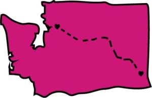
Here is my logo for my blog! I was inspired by a t-shirt I saw that connected where I from to Pullman. I think that it connects to my topic (me) because all of my blog posts have been about college and my transition here. The hearts represent the people I love at each location and the connection represents that even when I am away from one I still love and am always thinking about the family and friends that I have left behind. The pink in the state of Washington represents my favorite color and again ties into the subject…me! To create this logo I took the pen tool and created the outline for the shape of Washington. I used a point 5 thickness for the pen to emphasize the outline. Then, I used vector shapes (two circles, and a triangle) to create the heart shape. This was tricky to blend the shapes together to make it look like a heart, but I was pleasantly surprised by how they turned out. After that, I copied and pasted the image of the heart to make them the exact same. Finally, I used the pen tool again (with a point 3 thickness) and created the connection between the two hearts. I originally had a straight line connection between the hearts but I later went back and make it a little curved and I think that was the right choice. I kept it simple and clean and I think that it turned out great! I am still contemplating adding my name or text somewhere but I don’t know for sure what I want to do yet. Also, I might want to change the heart color to make them stand more. I would love some helpful advise on what I can improve on to make my logo even better, thanks!!
About Breanna Fee
about me, breannafee

- Comment
- Reblog
-
Subscribe
Subscribed
Already have a WordPress.com account? Log in now.
%d

October 8, 2014 at 9:49 pm
Thank you all for your useful comments, I will take all into consideration when I revise my logo for the final draft. A lot if not all of you mentioned adding text and I could not agree with you more. To be quite honest, it slipped my mind that I should even put text…duh! In addition, making the lines connecting the two cities a bit cleaner would make the logo a lot sharper and cleaner. I think that maybe playing around with the colors of the hearts may also add more to the logo. I am eager to perfect my logo and make it to the best of my ability! Thanks all 🙂
LikeLike